The loans granted in January plummeting (warning google translate)
As you can see from the Economist's Clicks and Mortar graph. France is between Canada and Australia for bubbling on the measure of prices relative to incomes.

The amount of loans granted by banks recorded a very sharp decline in January, falling 25.7% over the corresponding month of 2011, according to a study by the Observatory Credit Housing / CSA published Monday, February 6.Surprised they held out that long, given the environment there.
"The year 2012 did not start very well. In a sluggish economy, the backlash movement anticipation of the end of 2011 is significant," notes the study. On a monthly basis, the collapse is indeed brutal: - 49.4% between December 2011 and January 2012 (after already falling by 34.1% between December 2010 and January 2011). "It's a blow. The fall is comparable to 2009, when the U.S. subprime crisis, "said Michel Mouillart , professor of economics at the University of Paris West and industry expert.
As you can see from the Economist's Clicks and Mortar graph. France is between Canada and Australia for bubbling on the measure of prices relative to incomes.

Oh my, that doesn't capture the situation.

Borrowed from bulle-immobiliere
Hat Tip: Makaya commenting at Vancouvercondo.info
Added: per discussion of Australia's line on the chart
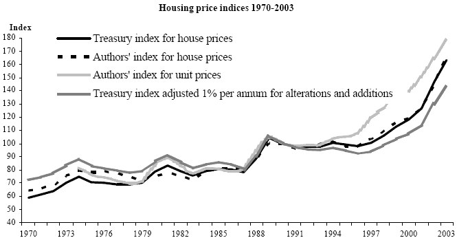 |
| Australia house prices 1970-2003 Chart from Abelson, Joyeux, Milunovich, & Chung |
Here is a chart of disposable income. On a log scale.
 |
| Real Gross Disposable Income, Australia 1970-2003 from Abelson, Joyeux, Milunovich, & Chung |

I turned on a few more lines for reference. This chart is zeroed to 1984, which makes it easier to see. 83, 84, 85 were pretty stable years for prices.
3 comments:
So zeroed at 1975 makes Australia 160% currently. Thats a lot lower than I expected. Some parts of Aus are currently at 7 x median annual income. Obviously that uses the current only, theres no comparison to previous years. Were houses actually quite expensive in the mid 70's?
Let me comment on that again. Now that I have coffee.
1975 looks like it was a localized peak given that the market needed to adjust downward after that. Here's a historic index chart, which I also added to the blog post.
http://i187.photobucket.com/albums/x308/LPShadow/HousePrices1970-2003.gif
On the economist graph, Australia dips below 100 for a whole 10 out of the 13 years following 1975.
Also, there were almost certainly structural changes in Australia since 1975 (incomes per household, major changes to building regs/density) and wages have risen in Australia pretty significantly. But like you say, the multiple is high now, and was it really that high in 75... Can't tell from this and I have a crazy day today, so I might not get to it for a bit.
Further thoughts on your multiplier question. Some areas may be at 7x, but the graph from the economist is for the country as a whole, which is going to be lower. It's a big place. So, let's say the whole country is at 5.5x. The two inputs (the index and the overvalued) are linear, so if we take a ratio of 5.5/160 and see what it is at 100, we get 3.4x which is elevated but not crazy.
Global Property Guide estimates the total median multiple is 6.1x right now for the country (which is flipping nuts). That would put 1975 at 3.8x. And it was a high year, so that's not impossible.
Post a Comment